Your flight school's landing page is doing one of two things: converting visitors into students, or wasting the money you spent getting them there. There is no middle ground.
If you are running Google Ads for "learn to fly [city]" or "discovery flight near me" and sending that traffic to your homepage, you are paying for clicks that bounce. Your homepage has navigation, multiple messages, and a dozen places for the visitor to click away from the conversion path. A landing page has one job and one path: convert the visitor into a lead.
I have reviewed and rebuilt landing pages for flight schools across Australia, the United States, and the UK. The patterns are remarkably consistent. The schools that convert well share the same structural elements. The schools that struggle make the same mistakes. This guide breaks down exactly what works.
The Anatomy of a High-Converting Flight School Landing Page
Every effective flight school landing page follows a predictable structure. The elements below are listed in order from top of page to bottom. Each one serves a specific function in the conversion process.
1. The Hero Section (Above the Fold)
The hero section is what the visitor sees before they scroll. It must accomplish three things in under five seconds:
- Confirm relevance — the visitor must instantly know this page is about learning to fly at a specific school in a specific location
- Communicate the core offer — what they are going to get (discovery flight, training programme information, free consultation)
- Present the CTA — the form or button that starts the conversion
Headline formula: [Action verb] + [specific outcome] + [location modifier]
Good examples:
- "Learn to Fly in Brisbane — Book Your Discovery Flight"
- "Start Your Pilot Training at Bankstown Airport"
- "Become a Pilot — Flight Training in San Diego from $249"
Bad examples:
- "Welcome to Our Flight School" (no action, no specificity)
- "Soar to New Heights with Aviation Training" (marketing cliche, no location)
- "The Best Flight School in the Country" (unverifiable claim, no CTA direction)
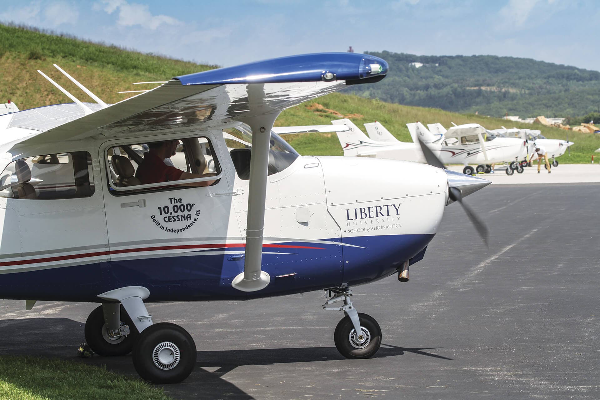
Background image: Use a real photo from your school — a student in the cockpit, your aircraft on the ramp, or a wide shot of your airfield. Real imagery outperforms stock photography every time. Prospective students can detect stock photos and they erode trust.
CTA placement: Either a short form (3 to 4 fields) directly in the hero section, or a prominent button that scrolls to the form below. The form-in-hero approach typically converts better because it eliminates the need to scroll.
2. The Trust Bar
Immediately below the hero, place a trust bar — a single row of credibility signals that reduce scepticism:
- Regulator certification (CASA Part 141/142, FAA Part 61/141, EASA ATO)
- Star rating and review count from Google ("4.8 stars from 67 reviews")
- Years of operation
- Number of students trained or licences issued
- Aircraft fleet size
These elements should be compact — logos, icons, and short text. They are not the main content. They are background credibility that the visitor absorbs at a glance.
3. The Value Proposition Section
Below the trust bar, expand on what the visitor gets and why it matters. This section should answer three questions:
What will they experience?
- Describe the discovery flight or training programme in concrete terms: duration, aircraft type, what they will do during the flight, what they will learn
- Use specifics: "A 30-minute flight in a Cessna 172 where you will take the controls, fly the circuit, and experience what pilot training actually feels like"
What makes your school different?
- Instructor qualifications and experience (total flight hours, instructor ratings)
- Fleet details (modern aircraft, well-maintained, specific types)
- Training outcomes (pass rates, career placements, student progression rates)
- Location advantages (controlled airfield, uncontrolled with less traffic, scenic area)
What does the path forward look like?
- From discovery flight to licence: a simple visual showing the training stages
- Estimated timelines and cost ranges
- Training pathway options (recreational, private, commercial)
4. Social Proof Section
Social proof is the most powerful conversion element after the headline and CTA. For flight schools, the most effective forms of social proof are:
Student testimonials: Real quotes from real students with their name and photo. Video testimonials are even stronger. Focus on testimonials that address common objections:
- "I was nervous about the cost, but the payment plan made it manageable"
- "I thought learning to fly would take years, but I soloed after just three months"
- "The instructors were patient and made every lesson feel structured and purposeful"
Google review excerpts: Pull two to three of your best Google reviews and display them with the reviewer's name and star rating. This borrows trust from Google's platform.
Milestone photos: First solo photos, checkride pass celebrations, graduation ceremonies. These show outcomes, not promises.
Numbers: Students trained, licences issued, years of operation, fleet size, average training time to licence. Specific numbers build credibility. Vague claims do not.
5. The Objection-Handling Section
Every prospective student has objections. A high-converting landing page addresses the top three to four before the visitor has to ask:
"Is it safe?" Address this directly. Mention your safety record, your maintenance programme, your instructor qualifications, and the regulatory framework you operate under (CASA, FAA, EASA). Do not shy away from the question — prospective students and their families are thinking about it even if they do not say it.
"Can I afford it?" Display pricing transparently. Mention payment plans, block booking discounts, or training account options. A cost calculator or "starting from $X" figure removes the unknown.
"Do I have time?" Explain typical training schedules. "Most students train two to three times per week and complete their PPL in six to nine months." Show that training fits around work and family commitments.
"Am I too old / too young / not smart enough?" Address age requirements and prerequisites directly. "You can start training at [minimum age]. There is no upper age limit. No prior experience or special qualifications are required — just a class 2 medical certificate, which your GP can help you obtain."
6. The Conversion Form
The form is where the page earns its keep. Every element of the form affects conversion rate.
Field count: Three to five fields. Name, email, phone number are essential. "What training are you interested in?" as a dropdown is useful for lead qualification. "How did you hear about us?" helps with attribution but is optional.
Form headline: "Book Your Discovery Flight" or "Request Training Information" — action-oriented, specific to the page's offer.
Submit button text: Never use "Submit." Use action-specific text:
- "Book My Discovery Flight"
- "Get My Free Training Guide"
- "Request a Call Back"
Privacy reassurance: A single line below the form: "We will never share your information. You will receive a response within [timeframe]."
Phone number option: Display a clickable phone number prominently near the form for visitors who prefer to call. Mobile visitors, in particular, will tap to call rather than fill out a form. Track these calls as conversions.
7. The Secondary CTA and Footer
Below the form, add a secondary CTA for visitors who are not ready to convert but are engaged:
- "Download our free training pathway guide"
- "Watch a 60-second video of what a discovery flight looks like"
- "Read what our students say about us"
These secondary CTAs capture visitors who need more information before committing. They should lead to ungated content (no email required) or a very low-friction opt-in (email only).
The footer should be minimal — school name, address, phone number, and a map. No navigation menu. No blog links. No social media icons that take visitors off the page.
Mobile Optimisation: Non-Negotiable
More than 60 percent of flight school landing page traffic comes from mobile devices — higher if you are running Google Ads with call extensions or Facebook/Instagram Ads. If your landing page is not optimised for mobile, you are losing the majority of your visitors.
Mobile-Specific Requirements
- Thumb-friendly tap targets: Buttons and form fields must be large enough to tap accurately on a phone screen. Minimum 48 pixels height.
- Single-column layout: No side-by-side columns that shrink to unreadable widths on mobile.
- Sticky CTA: A fixed button at the bottom of the mobile screen that stays visible as the visitor scrolls. "Book Now" or "Call Us" — always one tap away.
- Fast load time: Under three seconds. Compress images, lazy-load below-fold content, minimise JavaScript.
- Click-to-call: The phone number must be a tappable link on mobile. Test this on actual devices, not just in a browser's responsive mode.
For guidance on building a mobile-first flight school website design that converts, see our dedicated guide.
Message Match: The Ads-to-Landing-Page Connection
If your Google Ad says "Discovery Flights from $249 — Cessna 172 — Bankstown Airport" and your landing page headline says "Welcome to Our Flight School," you have broken the message match. The visitor clicked because of a specific promise. The landing page must deliver on that exact promise immediately.
Ad headline: "Learn to Fly in Brisbane — Discovery Flights from $249" Landing page headline: "Book Your Brisbane Discovery Flight — 30 Minutes in a Cessna 172 from $249"
The keywords, the price, and the location must match. When message match is strong, your quality score improves (reducing cost per click), your conversion rate increases, and your cost per lead drops. This principle applies to PPC campaigns across all platforms.
Page Speed and Technical Performance
A landing page that loads in five seconds instead of two seconds loses roughly 30 percent of its visitors before they see any content. For paid traffic, that means 30 percent of your ad spend is wasted.
Performance Checklist
- Images: Compress all images. Use WebP format. Serve different sizes for mobile and desktop. A hero image should be under 200KB.
- Fonts: Use system fonts or limit custom fonts to one family with two weights. Every additional font file adds load time.
- Scripts: Remove any script that does not directly support the page's conversion goal. Analytics and conversion tracking are necessary. Chat widgets, social proof popups, and animation libraries are usually not.
- Hosting: Use a modern hosting platform with a CDN (Vercel, Netlify, Cloudflare Pages). These serve content from edge locations close to the visitor, reducing latency.
- Above-fold rendering: The hero section should render before below-fold content loads. Use lazy loading for images and videos below the fold.
Test with Google PageSpeed Insights and aim for a mobile performance score above 85. Test on a real mobile device on a cellular connection, not just on your office Wi-Fi.
Conversion Tracking: Know What Works
Every landing page must have conversion tracking configured before it receives traffic. At minimum:
- Form submission tracking: A GA4
generate_leadevent fires when the form is successfully submitted. Track the source, medium, and campaign that brought the visitor. - Phone call tracking: Use a call tracking number or Google Ads call conversion tracking to attribute phone calls to the landing page.
- Thank-you page: After form submission, redirect to a dedicated thank-you page. This page confirms the submission, sets expectations for next steps, and serves as the conversion trigger for Google Ads and GA4.
Without this tracking, you cannot measure cost per lead, optimise your ad spend, or determine which landing page variant converts better. You are spending money in the dark.
Common Landing Page Mistakes
Sending ad traffic to the homepage. Your homepage serves multiple audiences and goals. A landing page serves one.
Too much text above the fold. The hero section should be scannable in under five seconds. Long paragraphs above the fold push the CTA down and reduce conversions.
Stock photography. A stock photo of a smiling person in a cockpit is worse than no image at all. Use your own aircraft, your own students, your own airfield.
No mobile optimisation. If you have not tested the page on an actual phone, you do not know whether it works on mobile.
Multiple CTAs competing. One primary CTA per page. "Book a Discovery Flight" is the goal. Do not also ask them to follow you on Instagram, read your blog, and sign up for a newsletter.
No social proof. A page with no reviews, testimonials, or student outcomes feels like a brochure. Add proof that real people have trained with you and succeeded.
Building Pages That Convert for Your School
The principles above apply universally, but the specifics — the right headline, the right price point, the right trust signals — depend on your market, your competition, and your positioning. A flight school in a competitive metropolitan market needs a different approach than a regional school with little direct competition.
If your landing pages are underperforming or if you are building new pages for a Google Ads campaign or website redesign, we can help. Off The Ground Marketing builds flight school marketing systems that are tested, tracked, and optimised for the aviation market — because we understand both the marketing mechanics and the aviation industry they serve.
Request a free audit and we will review your current landing pages, identify the conversion gaps, and recommend specific improvements that will lower your cost per lead and increase your student enrolments.